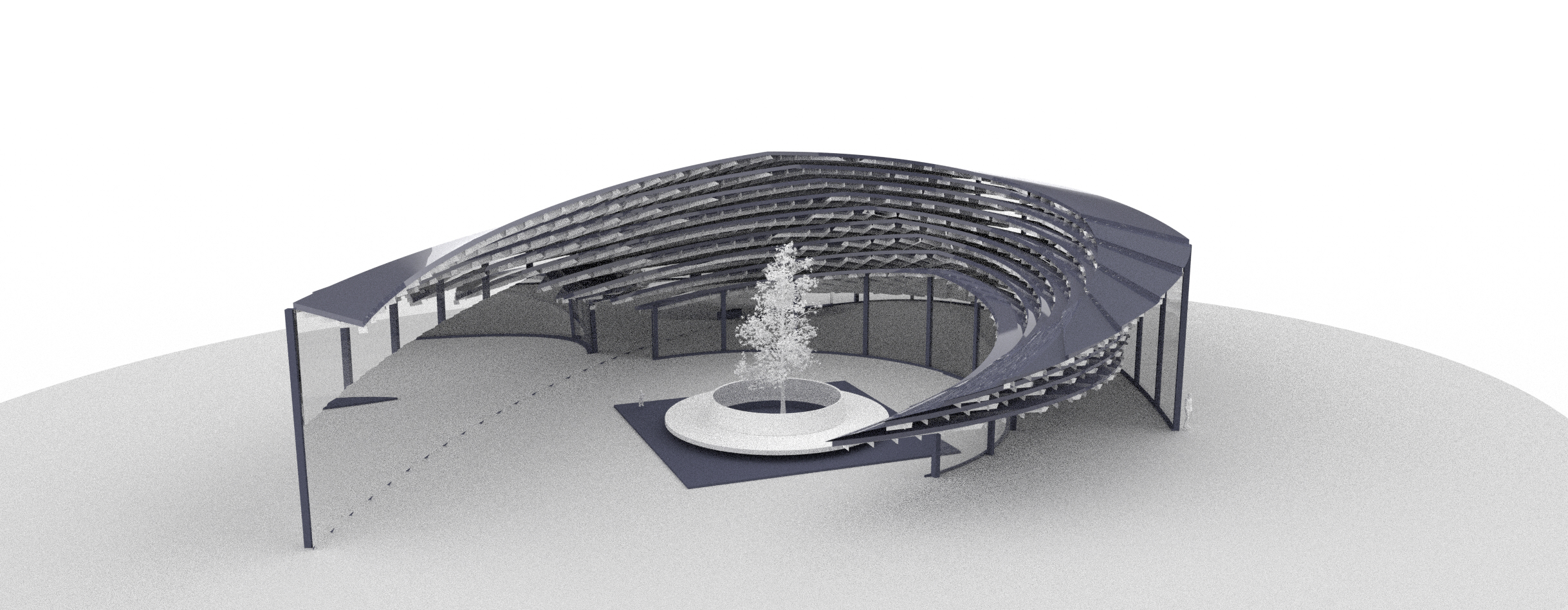
I exported the plan view of landscape pavilion from rhino and carried out the environment design in procreate. I wanted to reflect the ups and downs of the surrounding environment in the design, so I used contour line and color to design the level. The darker the color, the higher it was. At the same time, plants are added to the landscape pavilion to make it more relaxed. One side of the landscape pavilion is a glass curtain wall. I choose to point the glass curtain wall at the coastline, and try to avoid the appearance of tall trees between the glass and the coastline, so as to ensure the role of the building in view.


